Over the past year, we’ve launched a variety of new features and functionality as part of Collective Compass to help benefits teams better understand how their health plan is performing. For those who may not be as familiar, Collective Compass is our suite of products and services that simplifies how employers and consultants manage their full healthcare strategy—all from one convenient, connected platform.
Last summer, we launched the first phase of our new claims analytics tools, designed to empower benefits leaders to better evaluate their benefits strategy using service deep dives to contextualize claims data. These deep dives brought more detailed insights by service category (inpatient, outpatient, and more), clear visualizations, year-over-year comparisons, and enhanced filtering capabilities. This initial launch enabled benefits leaders to better craft, evaluate, and iterate on their benefits strategies.
Today, Collective Health is expanding our claims analytics tools to include deep dives across 18 clinical categories, which will help benefits teams:
- Better understand the health needs of member populations and the impact on spend and utilization
- Identify opportunities to further shape benefits strategies and address member needs, whether through plan design, partnerships, or other actions
- Develop a more holistic story for leadership, which helps explain plan performance and reinforce the best benefits approach for an organization and its people
What’s New
Explore cost and care with clinical category detail pages
Understanding changes in claims spend can often seem ambiguous, but it doesn’t have to be.
With new clinical category deep dives in Collective Compass, benefits leaders can closely review the distribution of claims spend across 18 major clinical categories including behavioral health, maternity, and musculoskeletal, among many others.

View data by conditions, services and more for a deeper understanding of claims activity.
Within the 18 clinical category detail pages, we offer numerous data view options, providing flexibility and better understanding around what drives claims activity. The expanded views improve visibility and help answer a range of questions across plans and member populations.
For example:
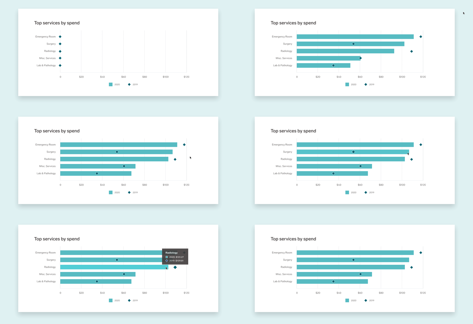
- Maternity surfaces to the top spend graph this year, and it’s evident by the year-over-year comparison that there’s been a major increase in claims dollars here. Is there anything that can be done with plan design to better support maternity care and family planning? Explore the Maternity & Fertility page to learn more.
- Cancer spend was high again this year. Was this due to the same type of cancers as last year? Is there anything that can be done to encourage preventive screenings, or second opinions? Dive into the Cancer page for more details.
Translate medical jargon into simple descriptions with tooltips

Tooltips make it faster and easier to contextualize clinical conditions in claims data.
Tired of having to research clinical terms and medical diagnoses like “spondylosis?”
We recognize that a big part of understanding claims data is proper contextualization, which can be very time consuming and takes benefits leaders away from other important work. To help, we’ve added tooltips to make this process faster and easier.
Tooltips provide a simple description for what a condition is and offer common examples. These quick snapshots give context to clinical conditions that may appear in claims data, helping benefits teams understand and focus on the most important insights, without needing a medical degree.
Identify what’s changing with enhanced year-over-year comparisons

New data visualizations make it easy to spot shifts in spend.
To bring benefits leaders even more visibility into plan performance and member care needs, we’ve expanded year-over-year comparisons from our most recent updates, to help explain what’s changing and why.
Enhanced year-over-year comparisons offer more opportunities to identify and delve into shifts in subcategories of spend, utilization, and unit cost. New data visualizations make it easy to spot the top spend categories and how they fluctuate between plan years. To go a layer deeper, the condition and service views offer year-over-year spend, utilization, and unit cost metrics to explain potential reasons for broader shifts at the clinical category or plan level.
Overall, these new features and updates are part of our continued dedication to evolve Collective Compass and make it easier for benefits leaders and consultants to understand performance, gather digestible insights, and manage and refine strategies, in service of our shared members and their health.
For more information about how to use claims analytics to maximize health benefits strategies and deliver more value for every dollar, please fill out the form below and a member of our team will be in touch!


